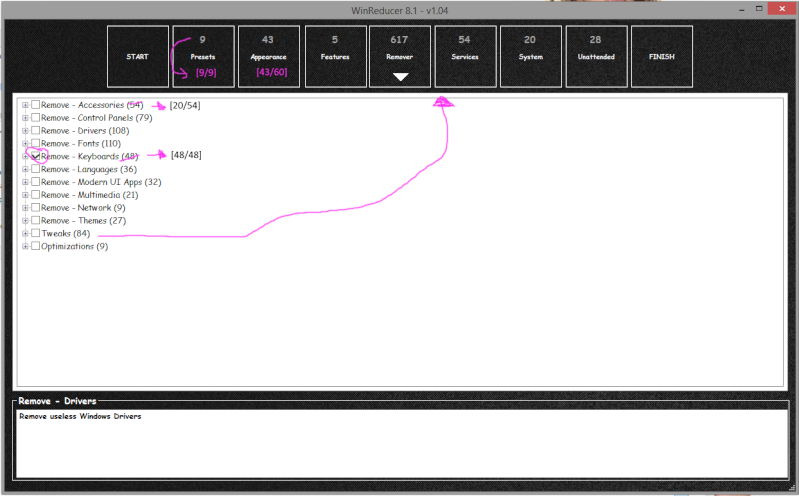
Just some minor changes to improve the UI
*If you have all the options ticked a tick box should show on the top level (atm it doesn't)
*The numbers show how many you have selected out of all the options same for the the Top catagories.
*Numbers should be after the title on top part.
*Tweaks Should be in a new tab of its own as it's not removing anything. (Plus when you add more it will need the space, see my post about new reg tweaks)


