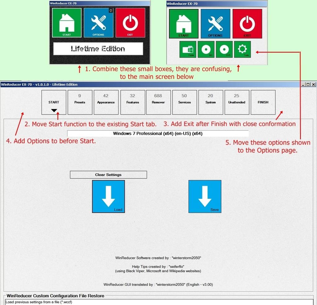
I have been struggling for some time trying to remember what is where with all of those separate boxes that pop up with the GUI the way it has been. It's a real challenge.
RT7 Lite had it right, almost everything is on one screen (with a few exceptions). No opening pop ups, then closing them (hoping it doesn't close the entire program).
Attached is a suggestion of combining those small screen into the main screen which would makes things much easier. I would also think it would make the entire GUI less complex with the additional code for those separate boxes removed.
One point I missed when I composed this a year ago is to move the line of the different sections vertically to the left side providing more vertical room for those really long lists under Services when one goes to expand it.


